- 所在位置:
- 首页 >
- 编程技术 >
- CSS/HTML >
- css写动态圆点发光效果代码
css写动态圆点发光效果代码
Admin 2021-04-25 群英技术资讯 1029 次浏览

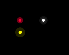
使用css我们能够实现很多酷炫有趣的动态效果,这篇文章就给大家分享用CSS3来实现动态发光的圆圈效果,明白css动态圆点的实现,我们还能够举一反三,实现星星发光效果等等。下面是动态发光的圆圈效果,感兴趣的朋友就继续往下看吧。
效果图:
代码:
<!DOCTYPE HTML>
<html>
<head>
    <title>纯CSS3实现圆圈动态发光特效动画</title>
    <style>
        body {
            background-color: #000000;
        }

        @keyframes twinkling {
            0% {
                opacity: 0.2;
                transform: scale(1);
            }

            50% {
                opacity: 0.5;
                transform: scale(1.12);
            }

            100% {
                opacity: 0.2;
                transform: scale(1);
            }
        }

        .circle-wrap {
            position: absolute;
            left: 100px;
            top: 100px;
        }

        .circle {
            position: relative;
            width: 24px;
            height: 24px;
        }

        .small-circle {
            border-radius: 50%;
            width: 12px;
            height: 12px;
            background: #FF0033;
            position: absolute;
        }

        .big-circle {
            position: absolute;
            top: -6px;
            left: -6px;
            width: 100%;
            height: 100%;
            border-radius: 50%;
            background: #FF0033;
            animation: twinkling 1s infinite ease-in-out;
            animation-fill-mode: both;
        }

        @keyframes scale {
            0% {
                transform: scale(1)
            }

            50%,
            75% {
                transform: scale(3)
            }

            78%,
            100% {
                opacity: 0
            }
        }

        @keyframes scales {
            0% {
                transform: scale(1)
            }

            50%,
            75% {
                transform: scale(2)
            }

            78%,
            100% {
                opacity: 0
            }
        }

        .smallcircle2 {
            position: absolute;
            width: 12px;
            height: 12px;
            background-color: #ffffff;
            border-radius: 50%;
            top: 100px;
            left: 200px;
        }

        .smallcircle2:before {
            content: '';
            display: block;
            width: 12px;
            height: 12px;
            border-radius: 50%;
            opacity: .4;
            background-color: #ffffff;
            animation: scale 1s infinite cubic-bezier(0, 0, .49, 1.02);
        }

        .bigcircle2 {
            position: absolute;
            width: 12px;
            height: 12px;
            border-radius: 50%;
            opacity: .4;
            background-color: #ffffff;
            top: 100px;
            left: 200px;
            animation: scales 1s infinite cubic-bezier(0, 0, .49, 1.02);
        }

        @keyframes scaless {
            0% {
                transform: scale(1)
            }

            50%,
            75% {
                transform: scale(3)
            }

            78%,
            100% {
                opacity: 0
            }
        }

        .item {
            position: absolute;
            width: 14px;
            height: 14px;
            background-color: #FFFF00;
            border-radius: 50%;
            top: 150px;
            left: 100px;
        }

        .item:before {
            content: '';
            display: block;
            width: 14px;
            height: 14px;
            border-radius: 50%;
            opacity: .7;
            background-color: #FFFF00;
            animation: scaless 1s infinite cubic-bezier(0, 0, .49, 1.02);
        }
    </style>
</head>
<body>
    <div class="circle-wrap">
        <div class="circle">
            <div class="big-circle"></div>
            <div class="small-circle"></div>
        </div>
    </div>
    <div class="smallcircle2"></div>
    <div class="bigcircle2"></div>
    <div class="item"></div>
</body>
</html>
这个效果的具体实现主要是用到了CSS3 的animation。它共有8个属性:
animation-name 规定 @keyframes 动画的名称。
用来定义一个动画的名称。
如果要设置几个animation给一个元素,我们只需要以列表的形式,用逗号“,”隔开
animation-duration 动画时长
用来指定元素播放一个周期的动画所持续的时间长,单位为秒(s)或毫秒(ms),默认值为0
animation-timing-function 规定动画的速度曲线。默认是 “ease”。
linear 规定以相同速度开始至结束的过渡效果(等于 cubic-bezier(0,0,1,1))。 ease 规定慢速开始,然后变快,然后慢速结束的过渡效果(cubic-bezier(0.25,0.1,0.25,1))。
ease-in 规定以慢速开始的过渡效果(等于 cubic-bezier(0.42,0,1,1))。
ease-out 规定以慢速结束的过渡效果(等于 cubic-bezier(0,0,0.58,1))。
ease-in-out 规定以慢速开始和结束的过渡效果(等于 cubic-bezier(0.42,0,0.58,1))。
cubic-bezier(n,n,n,n) 在 cubic-bezier 函数中定义自己的值。可能的值是 0 至 1 之间的数值。
animation-delay 规定动画何时开始。默认是 0。允许负值,动画跳过 2 秒进入动画周期,也就是从2s的动画开始
animation-iteration-count 规定动画被播放的次数。默认是 1
animation-direction 规定动画是否在下一周期逆向地播放。默认是 “normal”。
animation-fill-mode 规定动画在播放之前或之后,其动画效果是否可见。
animation-play-state 规定动画是否正在运行或暂停。默认是 “running”。
综合起来简写
animation : name duration timing-function delay iteration-count direction fill-mode play-state
以上就是关于css动态圆点的实现,希望本文对大家学习CSS3有帮助,想要了解更多的纯CSS3实现效果,大家可以继续关注其他文章。

免责声明:本站发布的内容(图片、视频和文字)以原创、转载和分享为主,文章观点不代表本网站立场,如果涉及侵权请联系站长邮箱:mmqy2019@163.com进行举报,并提供相关证据,查实之后,将立刻删除涉嫌侵权内容。
猜你喜欢
-
CSS中word-break属性能用于做什么,具有哪些值
word-break属性用于设置HTML页面中文本内容自动转换的处理方法。使用特定的属性值设置,可以通知浏览器实现任意位置的换行。word-break属性有三个值:normal、break-all、keep-all。
-
HTML超连接的使用是什么样,有何不同吗
在HTML中如果你想从这个页面连接到另一个页面就要使用a标记(超连接)1.普通连接<ahref="网址"target="目标窗口弹出方式">文本或图片</a>如果没有跳转目标可以将href="#'(表示空连接)。如果不写文本或不添加图片那么超链接是看不见的,也点不到。2.锚点连接<ahref="#box">盒子</a&am
-
CSS中怎样实现文字断裂的效果,代码是什么
CSS中怎样实现文字断裂的效果,代码是什么?小编通过实际的案例向大家展示了操作过程,简单易懂,有需要的朋友可以参考了解看看,那么接下来就跟随小编的思路来往下学习吧,希望对大家学习或工作能有帮助。
-
HTML的下拉框SELECT选项怎样设置更改
你知道如何改变HTML下拉框SELECT选项吗?在HTML中改变下拉框SELECT选项是经常的事情,那么接下来我们就一起跟爱站小编去看看吧。
-
Canvas中如何填上渐变色的效果,代码是什么
在我们打开某个网页的时候,可能会看到有的页面中有颜色的渐变,感觉很好看,那么,这种渐变色是如何实现的呢?所谓渐变色其实就是颜色之间的过渡,而html5 Canvas渐变是一种用于填充或描边图形的颜色模式,所以,利用canvas如何实现颜色的渐变?本篇文章就来给大家介绍一下canvas渐变色的实现。


推荐内容
成为群英会员,开启智能安全云计算之旅
立即注册

Copyright © QY Network Company Ltd. All Rights Reserved. 2003-2020 群英 版权所有
增值电信经营许可证 : B1.B2-20140078 粤ICP备09006778号 域名注册商资质 粤 D3.1-20240008


