- 所在位置:
- 首页 >
- 编程技术 >
- CSS/HTML >
- 用css写圆形镂空打孔效果的优惠券
用css写圆形镂空打孔效果的优惠券
Admin 2021-04-25 群英技术资讯 927 次浏览

我们在开发电子商务网站时,往往会遇到发开商场优惠券的需求,那么我们就需要考虑优惠券的样式。边缘镂空打孔效果,是我们经常能在一些优惠券的设计上能看到的,下面是就给大家分享一下css圆形镂空效果的实现。大家在做优惠券时,能参考一下。
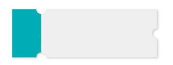
.hollow-compose-three-circles {
  width: 300px;
  height: 100px;
  position: relative;
  background: radial-gradient(circle at right top, transparent 10px, #00adb5 0) top left / 60px 51% no-repeat,
    radial-gradient(circle at right bottom, transparent 10px, #00adb5 0) bottom left /60px 51% no-repeat,
    radial-gradient(circle at left top, transparent 10px, #eeeeee 0) 60px 0/230px 51% no-repeat,
    radial-gradient(circle at left bottom, transparent 10px, #eeeeee 0) 60px 50px /230px 51% no-repeat,
    radial-gradient(circle at 10px 50px, transparent 10px, #eeeeee 0) 290px 0/10px 100px no-repeat;
   filter: drop-shadow(2px 2px 2px rgba(0,0,0,.2));
}

.hollow-compose-three-circles::after {
  content: '';
  height: 80px;
  border: 1px dashed #fff;
  position: absolute;
  left: 60px;
  top: 0;
  bottom: 0;
  margin: auto;
}
<div  class="hollow-compose-three-circles"></div>
<!doctype html>
<head>
<meta charset="UTF-8">
<title>process</title>
<style>
	body{
		background: gray;
	}
   .many-circles {
      margin: 10px 0 0 40px;
	    width: 200px;
	    height: 100px;
	   background: radial-gradient(circle at right, transparent 10px, #00adb5 0) top right / 51% 60px no-repeat,
	    radial-gradient(circle at left, transparent 10px, #00adb5 0) top left / 51% 60px no-repeat;
	    /*radial-gradient(circle at  top right, transparent 10px, #eeeeee 0) bottom right / 51% 40px no-repeat,
	    radial-gradient(circle at left top, transparent 10px, #eeeeee 0) bottom left / 51% 40px no-repeat;*/
	   filter: drop-shadow(2px 2px 2px rgba(0,0,0,.2));
}

</style>
</head>
<body>

 <div data-v-85036100="" class="many-circles"></div>
<script>
</script>
</body>
</html>
效果如下

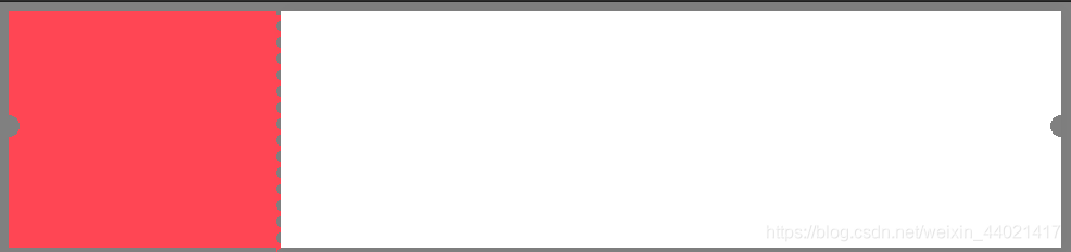
<style>
	body{
		background: gray;
	}

   .hollow-one-circle{
		display: inline-block;
	  width: 246px;
	  height: 218px;
	  position: relative;
	  background: radial-gradient(circle at 0 106px, transparent 10px, #FF4654 0) top left/246px 100% no-repeat;
	}
	.hollow-one-right{
		display: inline-block;
		width: 718px;
		  height: 218px;
		  position: relative;
		background: radial-gradient(circle at 718px 106px, transparent 10px, #ffffff 0) top left/718px 100% no-repeat;

box-shadow:3px 0px 13px 0px rgba(0,0,0,0.03);
	}

.hollow-one-circle::before {
  content: '';
  position: absolute;
  height: 100%;
  width:5px;
  top: 4px;
  left: 246px;
  background-image: linear-gradient(to bottom, #FF4654 5px, transparent 5px, transparent),
  radial-gradient(10px circle at 5px 10px, transparent 5px, #FF4654 5px);
  background-size: 5px 15px;
}
.hollow-one-circle:after {

}
</style>
<div data-v-85036100="" class="hollow-one-circle"></div>
<div data-v-85036100="" class="hollow-one-right"></div>
以上就是css圆形镂空的代码介绍。css圆形镂空除了能够用作优惠劵样式,还能做邮票,打孔纸张效果样式等等,大家能够发挥自己的想象。对css圆形镂空就介绍到这,希望对大家学习有帮助。

免责声明:本站发布的内容(图片、视频和文字)以原创、转载和分享为主,文章观点不代表本网站立场,如果涉及侵权请联系站长邮箱:mmqy2019@163.com进行举报,并提供相关证据,查实之后,将立刻删除涉嫌侵权内容。
猜你喜欢
-
css背景图片可以做哪些效果?教你六种方法
css背景图片可以做哪些效果?其实css背景图片不仅可以做平铺的效果,还能实现很多丰富炫酷的效果,例如做三角形分割背景,网格背景,渐变背景等等,这篇文章给大家分享几种做CSS图片背景的方法,感兴趣的朋友就继续往下看吧。
-
HTML5中main标签的居中的实现方法是什么
本篇文章中主要的介绍了关于HTML5 main标签的居中,里面有完整的main标签的用法实例,现在让我们一起来看这篇关于HTML5 main标签的介绍吧
-
CSS中动画的基础知识是什么,怎样实现奔跑小熊的动画
CSS如何实现动画一?什么是动画?动画就是一帧又一帧图片,按顺序展现在人的眼前,但是由于人的视觉反应不过来就会产生图画动起来的效果。下文有实例供大家参考,对大家了解操作过程或相关知识有一定的帮助,而且实用性强,希望这篇文章能帮助大家,下面我们一起来了解看看吧。
-
CSS中变换和过渡分别如何实现,效果不同在哪
本篇文章给大家带来了关于css的相关知识,其中主要介绍了关于transform变换和transitions过渡的相关问题,一起看看CSS实现盒子的转换与过渡效果,希望对大家有帮助。
-
css3的transform缩放在IE浏览器下有抖动怎么解决?
css3的transform缩放在IE浏览器下有抖动怎么解决?因为浏览器的兼容问题,transform: scale();缩放在IE浏览器下会有过渡抖动的问题,那么我们有什么办法可以解决吗?接下来小编就与大家一起来探讨一下。


推荐内容
成为群英会员,开启智能安全云计算之旅
立即注册

Copyright © QY Network Company Ltd. All Rights Reserved. 2003-2020 群英 版权所有
增值电信经营许可证 : B1.B2-20140078 粤ICP备09006778号 域名注册商资质 粤 D3.1-20240008


